BEFORE THE MOMENTS: LOOKING AT THE BRISBANE 2032 EMBLEMS
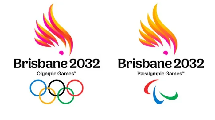
I’ve been thinking about these Brisbane 2032 emblems since I first saw them.
I really like them, but I also keep coming back to them.
As someone who spends a lot of time thinking about sports, design and the stories we attach to them, I’m always interested when a new Olympic and Paralympic identity is revealed. There’s something different about designing for an event that hasn’t happened yet.
You’re creating something that will eventually sit alongside moments that, right now, don’t exist.
The athletes haven’t walked into the venues. The medals haven’t been won. The photographs that will define Brisbane 2032 haven’t been taken.
But the first piece of that visual story is already here.
I think that’s what caught my attention.
A very Queensland beginning
The first thing that stood out to me is how specific these feel to their place.
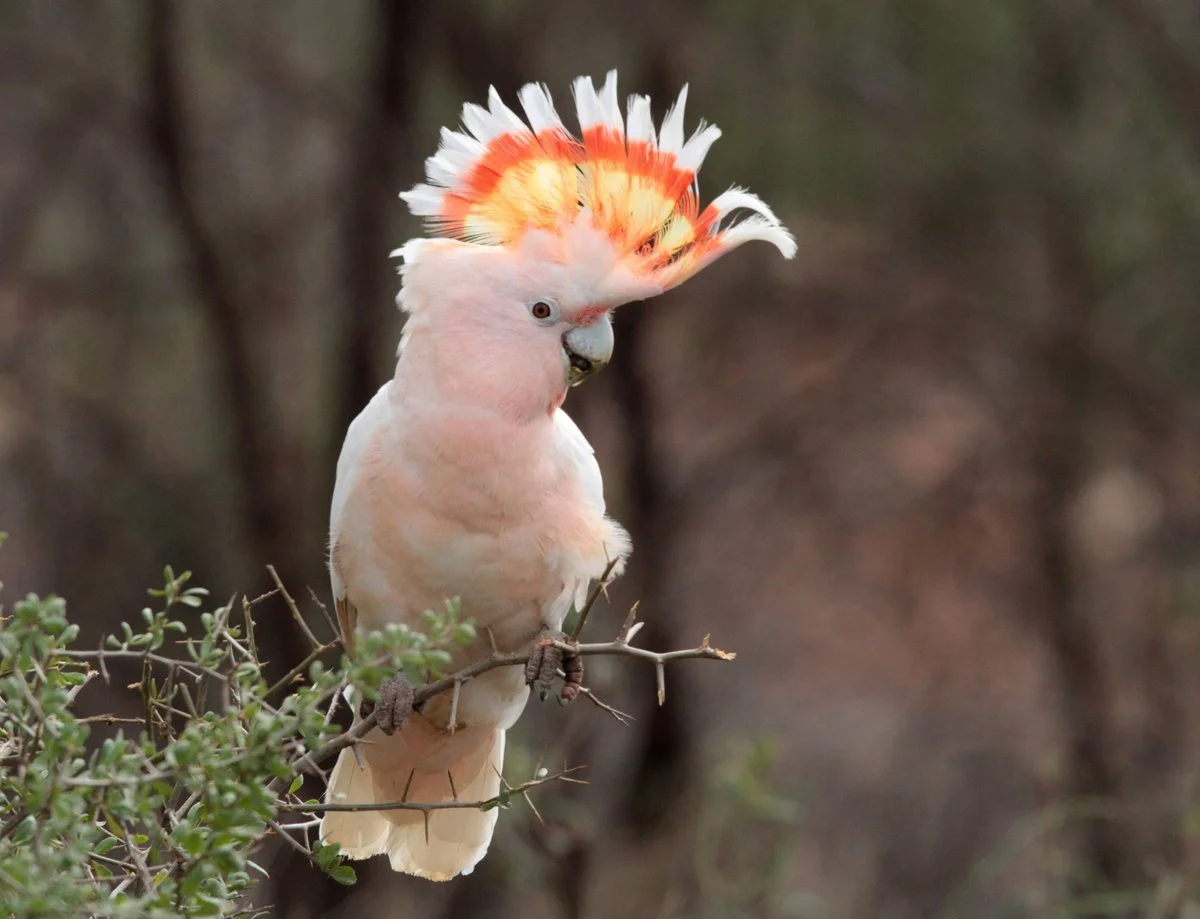
The Olympic emblem features a pink cockatoo, while the Paralympic emblem uses a sulphur-crested cockatoo with its bright yellow crest. The birds are more than a nod to Australia. Their shapes actually incorporate Queensland, with the eye positioned around Brisbane.
That’s one of my favorite details in the identity. The location isn’t just something the emblem represents. It’s built directly into the form.
The cockatoo’s crest adds another layer, referencing the Olympic and Paralympic flame without literally drawing a flame into the mark. It’s a subtle connection to the Games that still feels natural within the shape of the bird.
Then there’s the color.
The Olympic emblem moves from gold into pink, a combination that feels like a Queensland sunset. The Paralympic version brings in the bright yellow of the sulphur-crested cockatoo, giving each identity its own personality while keeping the overall concept connected.
Visually, there’s a lot happening in these relatively simple forms.
Olympic and Paralympic, together
The relationship between the two identities is something I don’t want to overlook.
They aren’t identical, but they clearly belong to the same world. The cockatoo gives them a shared visual starting point, while the differences in color and form give each one its own character.
The Olympic and Paralympic Games are connected, but they don’t have to look exactly the same to feel connected. Here, the relationship is clear without making the two identities feel interchangeable.
That balance is one of the harder things to get right in an identity system.
A different approach
It’s also interesting to look at Brisbane alongside some of the other Olympic and Paralympic identities, because they each take such a different approach to representing their host city.
Sydney 2000 had an identity that felt deeply connected to Australia and its host city.
Paris 2024 took a very different approach. Its emblem brought together the gold medal, the Olympic and Paralympic flame, and Marianne, a symbol of France. It was also the first time the Olympic and Paralympic Games shared the same emblem, reinforcing the idea that the two Games were part of one shared vision.
Los Angeles 2028 is almost the opposite. Instead of trying to create one symbol that represents all of Los Angeles, the LA28 identity was built around a flexible “A” that can constantly change. The idea is that no single mark could capture a city as diverse as Los Angeles, so the identity leaves room for different people, stories and creative expressions to become part of it.
Brisbane feels different again.
The starting point is much more specific. It’s Queensland. It’s the cockatoo. It’s the colors. It’s Brisbane’s place within the shape of the bird.
I like seeing those different approaches side by side. There isn’t one formula for creating an Olympic or Paralympic identity. Each host gets to decide what parts of its place, culture, and story it wants to put at the center.
That’s part of what makes seeing each new one so interesting.
Where the identity goes next
The part I’m probably most interested in as a designer is what happens next.
An Olympic and Paralympic identity has to work across the entire Games environment, from medals and venue signage to social media and digital platforms to merchandise and everything else the Brisbane 2032 brand will eventually touch.
That’s where the design gets tested.
A good emblem needs to be recognizable on its own, but a Games identity needs to be able to do much more than that. I’m curious to see how the cockatoo becomes part of larger layouts, how the shapes are used as graphic elements, and how the color system develops across different applications.
Will the bird always be shown in full? Will pieces of the form become patterns or supporting graphics? How much can the visual language stretch before it starts to lose the simplicity that makes the emblem work?
Those are the details I’ll be watching.
We’ve seen the starting point.
Now I want to see how it lives in the world.
More than a visual identity
That’s what makes sports branding so interesting to me.
A design can look one way when you’re sitting at your computer working on it, and then feel completely different once you see it being used in the real world.
For Brisbane, that will happen when the identity is surrounded by the athletes, venues, crowds and moments that make up the Games.
What will it feel like when we see it over and over again?
Eventually, years from now, someone might see that cockatoo and immediately think of Brisbane 2032.
You can create the identity, but you don’t get to decide what it ultimately means.
The athletes, the fans and the moments do that.
Brisbane 2032 is still six years away.
For now, this is just the beginning.
The rest of the story is still waiting to happen.
